Rowing new Zealand
Tracing Success
Rowing New Zealand is prestigious organisation with a long legacy and contribution to the sports in New Zealand. The brand identity reflects excellence and tradition. My design contribution to the brand creates a visual contrast between tradition and modernity. The result – an elegant, bold and timeless approach.
NEW ZEALAND BLACK
SUNRISE
GOLD
Editorial design
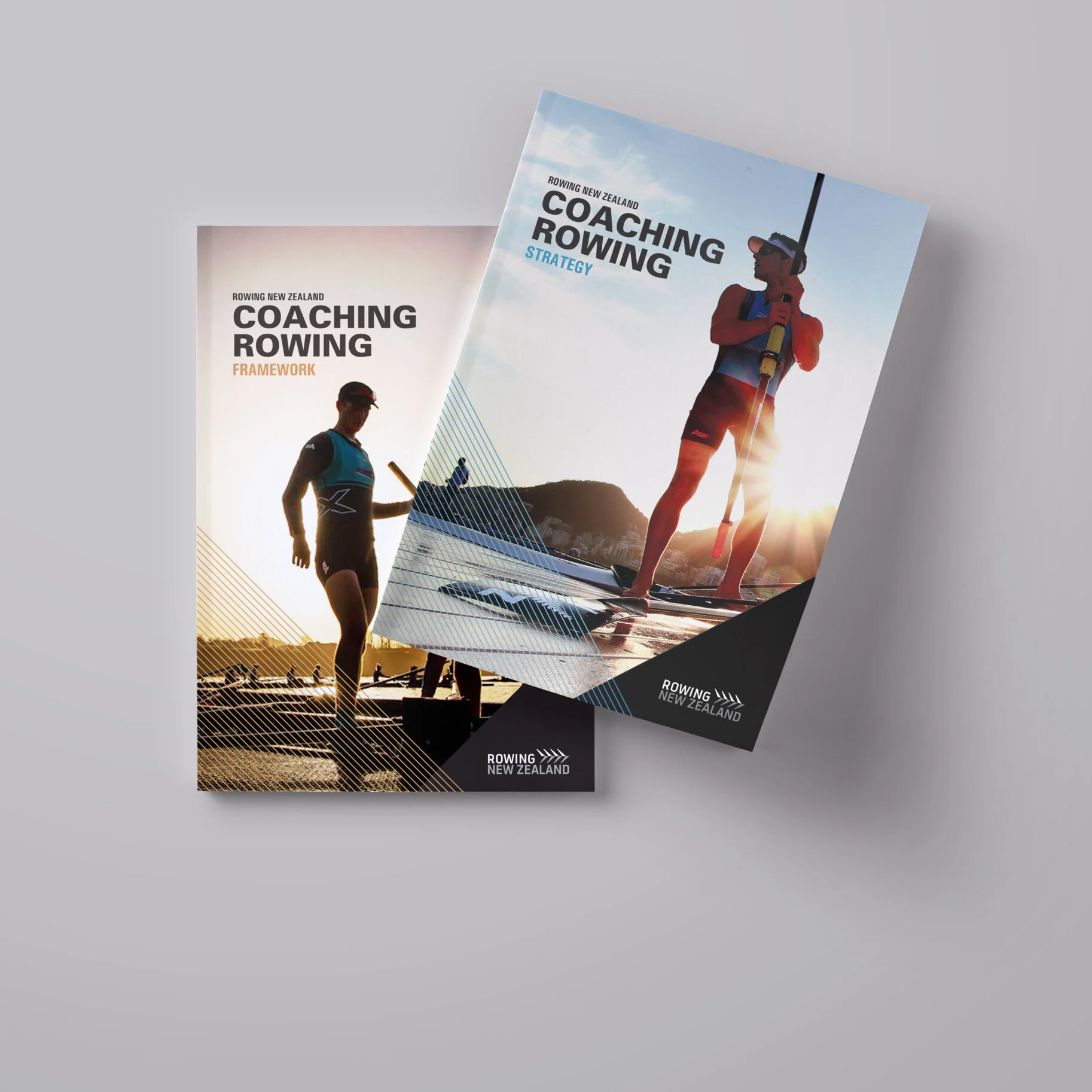
Framework & Strategy
These two corporate documents were designed to present the strategic work of the organisation. The use of impactful, strong photography are characteristics of this brand. The brand colours reflect the beauty of a sunrise on an early morning to start the training day and also the highest achievement and the ultimate pursuit for gold, prestige, recognition and awards.
The design is clean, bold and elegant to reflect the high quality attributes of the organisation and brand identity.
Brand identity
Word of honour
The Rowing New Zealand Legacy Award acknowledges past and present elite rowing athletes in New Zealand. The logo combines heraldic elements with two oars to reflect excellence, tradition and the sport itself. It includes the silver fern from Rowing NZ to connect to the organisation. Black represents New Zealand while gold stands for the prestige of the award. This logo contrasts tradition with a modern, elegant, bold and timeless approach.
Event communications
Honouring Excellence
This collection of elements were created to celebrate a gala night to award prominent sports women and men in the history of the sport. The brand identity of the event is elegant, classic and heraldic, qualities related to the tradition and identity of the sport. The dark imagery provide a contrast with white clean and elegant backgrounds and the gold colour conveys refinement, success and recognition.
Corporate Communications
2016 Annual Report
The Rowing New Zealand 2016 Annual Report commemorates 130 years of a solid sport organisation and showcases New Zealand athlete’s merits in the 2016 Olympic Games in Rio. This publication design takes a refreshed approach with tones of gold, a very visual photographic imagery and new design elements throughout, which infuse this comprehensive document with a refined aesthetic.
Logo Design
A programme to develop coaches
RNZ created a programme to develop coaches with ambitions to progress in their coaching. This logo was created to identify the new programme. The typographic logo combines a solid and outline treatment to provide visual contrast and evoke sports lettering. The typeface has customised characters to create unique features, particularly the ‘double e’ represent two rowers and becomes an isolated graphical element for a quick identification. The angle creates a sense of forward motion and provides a dynamic feature to the overall logo.
In this logo design, I customised the typeface to create unique features, particularly the ‘double e’ characters which represent two rowers that become an isolated graphical element for a quick identification.
Design Credit: Patricia Aguilera
Brand / Project Name: Rowing New Zealand Corporate Communications
Project Type: Editorial Design, Brand Identity Design, Event Identity Design
Project Category: Sports Organisation
Project Type: Agency Design / Published
Design Deliverables: Graphic Design, Editorial & Publication Design, Logo Design


